Do you love the Moomin comics? Would you like to learn more about the Moomin comics art style?
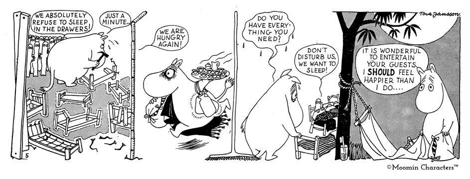
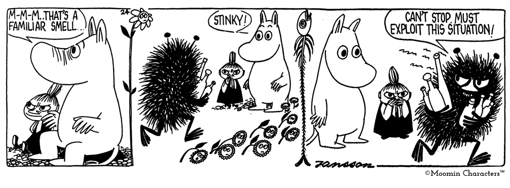
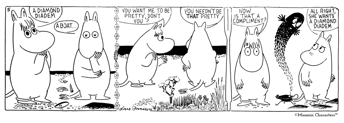
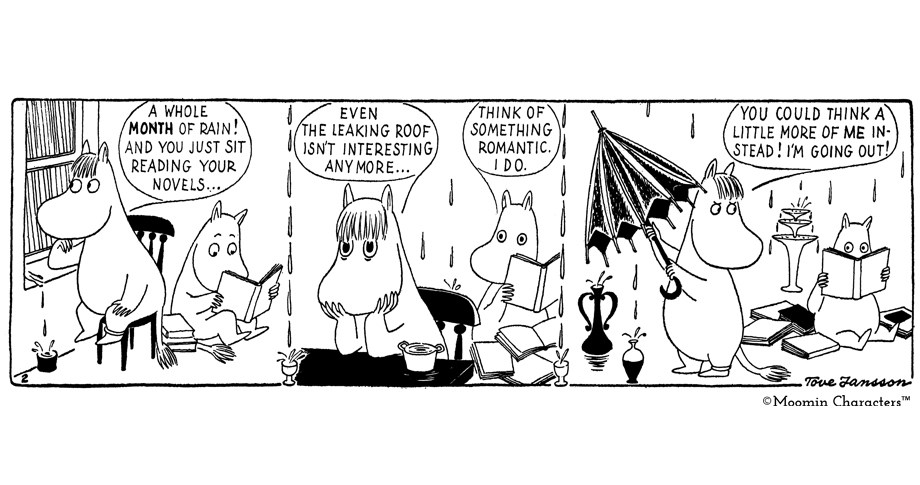
Have you ever noticed how Tove and Lars Jansson used visual objects as a boundary between the panels in the comic strips? Many of the boundaries are of course just straight lines but often Tove and Lars both created the boundaries with the scenery, trees, curtains, ropes, doors, hat stands, pearls, flowers etc.
With these vertical objects, the transition from one panel to the next one is smooth and delightful and at the same time the items from the narrative steps out from the strip into the frame. Moomin comics were the pioneers of this kind of art.

Moomin and the Brigands 1954-1955
Tove Jansson

Moomin and the Comet 1958
Tove & Lars Jansson

Moomin and the Comet 1958
Tove & Lars Jansson

Moomin´s lamp 1960
Lars Jansson
If you haven´t noticed this before now it is time to read the Moomin comic books again! Don´t have them yet? Buy them here!
